Aesthetic Calendar Wallpaper for iPhone: Ideas That Stay Current
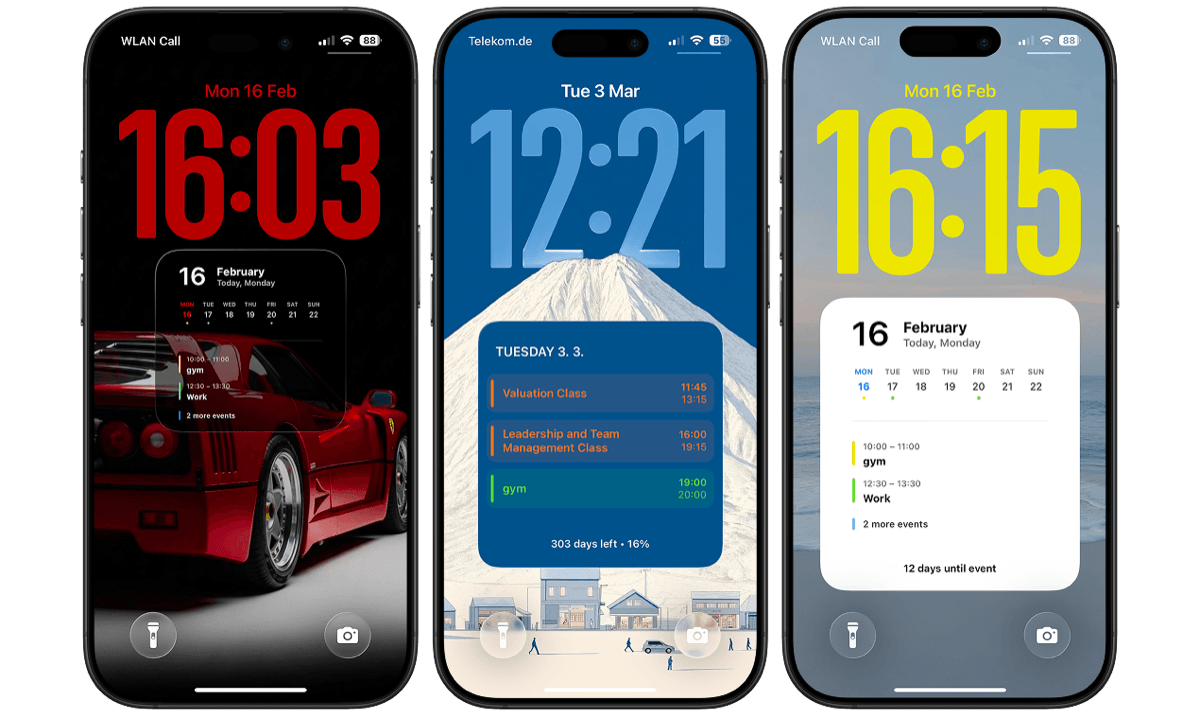
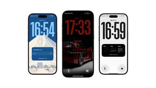
Seven looks for a calendar wallpaper, from paper and ink to a photo underneath. All of them show the real date.
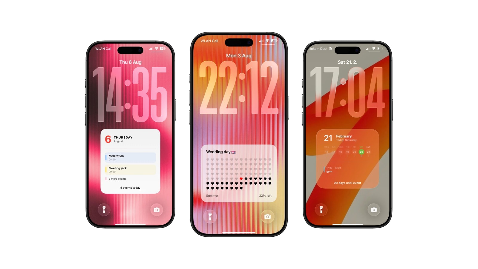
An aesthetic calendar wallpaper has to survive two tests that a normal wallpaper does not: it has to stay correct as the date moves, and it has to stay readable underneath the clock, the widget row and whatever notifications land on it.
Most of the beautiful calendar wallpapers circulating online fail the first test on the first of the following month, because the dates are painted into the image. Generating the wallpaper instead solves that quietly: the look is yours and the dates come from the current date, so a paper-and-ink grid you liked in March is still a paper-and-ink grid in October, showing October.
Below are seven directions that hold up in real use rather than in a screenshot, and the specific decision that makes each of them work.
1. Paper and ink
Warm white, charcoal type, one thin rule. This is the most forgiving of all the looks because the structure of the calendar is doing the design work, so it survives a busy month without turning into noise, and it stays legible in daylight where darker treatments struggle.
The detail that separates a good version from a flat one is refusing pure values. Pure white with pure black is harsh at night and slightly clinical in the day; a background pulled a few percent warm and an ink softened towards charcoal reads like a notebook instead of a spreadsheet. Month and agenda layouts suit this best, since both have enough structure to carry it.
2. One quiet colour
Pick a single colour you would be happy to see every day for a month, and let the calendar colours be the only other colour on the screen. Deep blue, forest green, warm grey and clay all age well. A five-stop gradient does not, because it competes with the event colours and there is nowhere for the type to be safe.
This is also the safest choice for a dense schedule. A flat field gives small dates and long titles the contrast they need, and it is the one background that never accidentally puts a bright highlight behind a row of text.
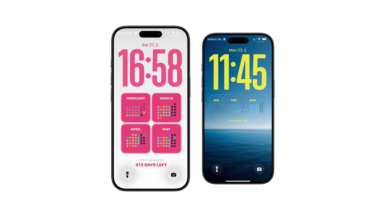
3. A small card in a lot of space
A compact card holding today’s date, three reminders or one line, with most of the screen left empty. The emptiness is the design; the moment you fill it, the card stops looking deliberate and starts looking like a layout that ran out of content.
The failure mode is predictable. People like the card, then try to fit a week into it, and end up with a small dense rectangle that is harder to read than a full-screen list would have been. If the content grows, change the layout rather than the card.
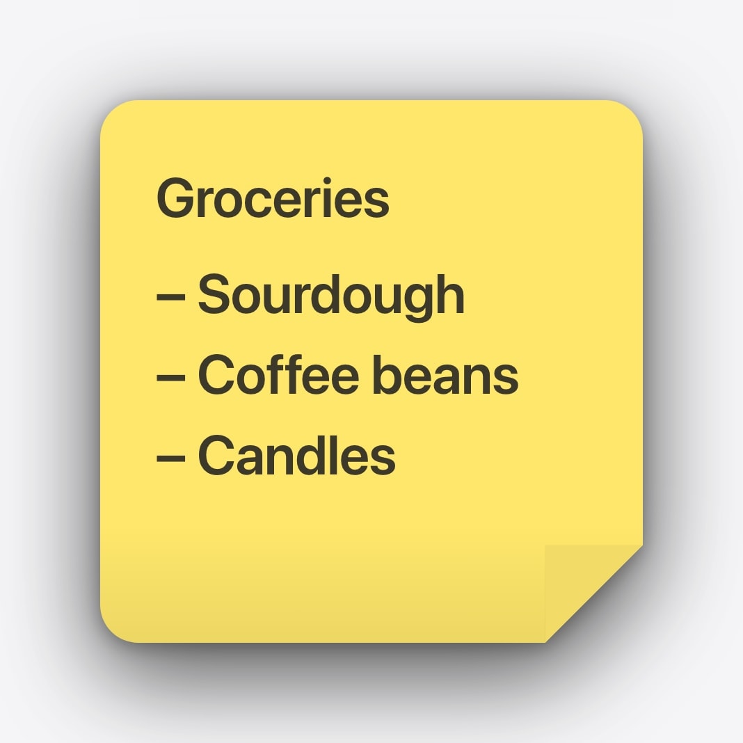
4. A photo with somewhere for the type to sit
The trick is choosing the photo for its empty regions rather than for its subject. Sky, water, a wall, an out-of-focus background: all of those are places a calendar can live without a fight. Crowds, foliage, street signage and patterned fabric are not, and no amount of blurring rescues them, because blurring the whole image also removes the reason you picked it.
If the photo is nearly right, darken or lighten a panel behind the calendar rather than filtering the entire picture. It is a smaller intervention and it keeps the parts of the image you actually wanted. Then look at it as a real Lock Screen, with the clock and a notification on it, before deciding it works.
- Photos that work
One clear subject, simple composition, and a large calm area roughly where the calendar will land.
- Photos that fight back
High-contrast patterns, text in the image, faces near the centre, bright highlights directly under small type.
- The cheapest fix
A soft local panel behind the calendar. It costs almost nothing visually and buys back all the contrast you need.
5. Monochrome
Black, white and grey remove the argument between event colours and the background, which is why monochrome so often looks more expensive than a colourful version of the same layout. Hierarchy has to come from weight, size and spacing instead, and that constraint tends to produce a better composition.
On an OLED iPhone a true black background is genuinely striking, since the pixels are off rather than dark. The thing to watch is secondary text: what looks like an elegant mid-grey indoors can vanish completely on a sunny pavement, so check it outside before you commit.
6. A seasonal frame around a stable calendar
Keep the grid and the typography fixed all year and let exactly one element change with the season: a border, a background photograph, an accent colour. The screen feels new every couple of months without you rebuilding a layout, and the part you read stays where your eye already expects it.
This one only works with automatic generation. If the dates were painted in, a seasonal refresh would mean redrawing the whole calendar four times a year, which is the chore that kills every static wallpaper eventually.
7. One enormous thing
A single large date, a countdown number or the next event, and almost nothing else. Bold looks effortless here because everything inessential has already been deleted, not because the type is large.
Choose it when one piece of information genuinely changes what you do: days until the flight, the date of the exam, the one meeting you must not miss. It is the wrong choice for an overview, and the giveaway that it is being misused is when the large element is surrounded by five small ones trying to be equally important.
Change one thing at a time. Layout first, then background, then colour. Change all three at once and you will not know which one made it better.
The two rules that decide whether any of this works
Readability comes first, and it is not the opposite of taste. A calendar you have to look at twice has already failed, however good it looks in the App Store screenshot, and the wallpapers people keep for a year are almost always the quieter ones.
The second rule is that the layout should match the content, not the mood. A dense week does not fit in a small card; a single countdown does not need a month grid around it. Every look above works when it is carrying the right amount of information and falls apart when it is carrying somebody else’s.
Questions people ask
Most are static downloads from wallpaper sites or Pinterest with the month painted in. Generated wallpapers can look the same and use the current date and your own calendar data.
Yes. Calendarly generates a fresh image on the iPhone and a Shortcuts automation applies it on a schedule.
Yes. Choose one with an open area where the type will sit, and preview it with the iOS clock visible before saving.
A short agenda, a large date or a compact card. A dense month grid over a photograph is the hardest combination to keep legible.
No. The calendar is drawn into the wallpaper itself. The system clock and any widgets stay above it.