Todoist Lock Screen Ideas for a Minimal Productivity Setup
Seven useful Todoist wallpaper ideas, from a plain checklist to a project, upcoming agenda or countdown with next actions.
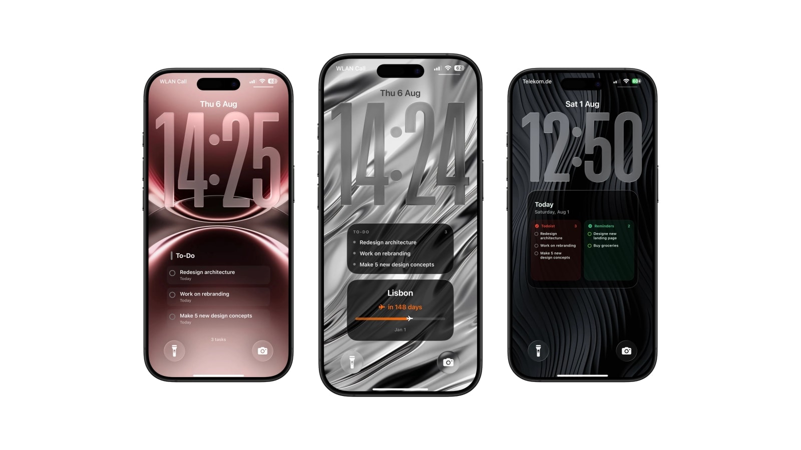
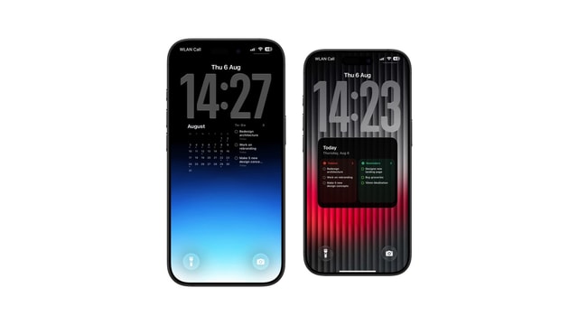
A Todoist Lock Screen is decided by selection rather than by styling. The same account can become one task in large type, a short checklist, a project card, an upcoming agenda, a month with task signals, a split list next to Apple Reminders, or a countdown with the next actions beside it.
Every element you add takes space from the task titles, which are the only part you genuinely read. So the useful way through the list below is to find the question you actually ask each morning, then pick the layout that answers it and nothing else.
These are all wallpaper layouts generated from connected Todoist data. None of them is a Todoist widget, and all of them update when the wallpaper shortcut runs.
1. The plain checklist
Today and overdue, five or six rows, a quiet background. This is the strongest default because it spends all of its space on task names and nothing on anything else, and it carries priority and due information without needing a legend.
If it strikes you as unremarkable, that is close to the point. A list you read every morning for a year should be easy to read rather than interesting to look at, and the ones people abandon are almost always the ones they admired first.
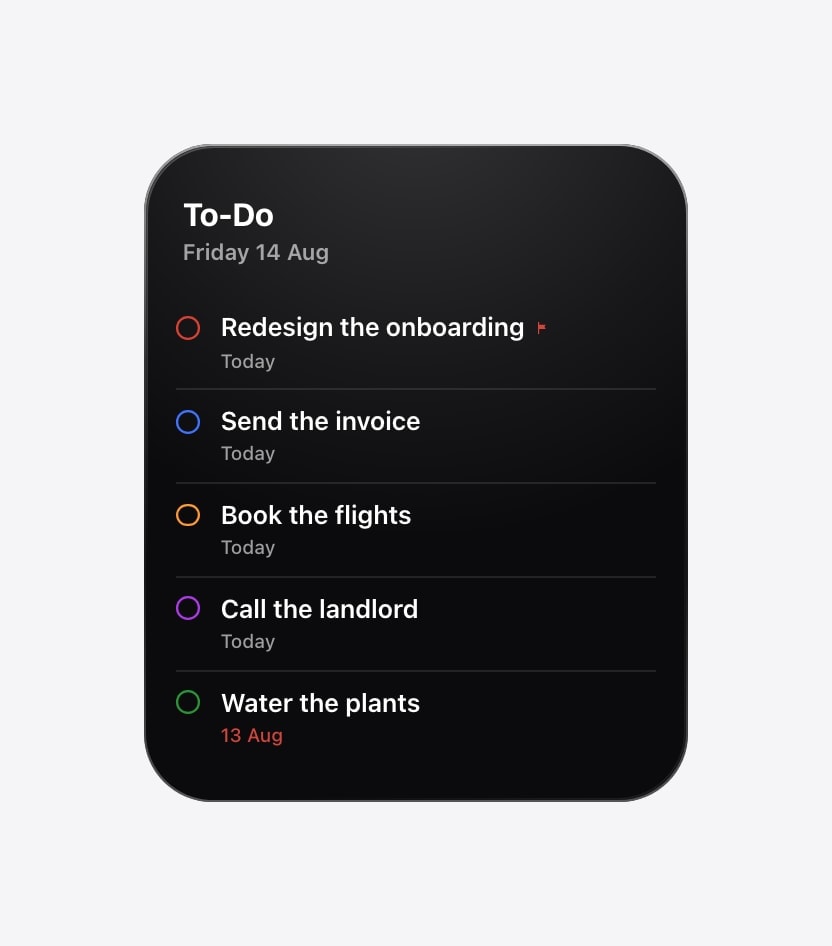
2. One task, very large
A focus layout drops everything except the first thing, at a size you cannot pretend not to have seen. It suits deep work, a difficult phone call, or the sort of day where a list of six is the reason nothing gets started.
It fails when it is used to make five priorities look equally urgent, which is a temptation the layout invites. Let the order in Todoist decide what comes first, and let the screen show only that.
3. One project, temporarily
A project card is excellent during a launch, a move, a trip or an exam period, when one body of work genuinely deserves to displace everything else. Select the project, keep the list short, and switch back to today when the intense stretch ends.
Leaving it up permanently is the trap. Every small obligation outside that project becomes invisible, and because the screen still looks organised, you will not notice for a fortnight. Treat it as a mode with an end date.
4. The upcoming agenda
Grouping tasks by day is for preparation rather than execution: it shows the slope of the next week instead of the ground under your feet. That is the right view on a Sunday evening, before a heavy deadline stretch, or when you are deciding what to move.
Keep undated tasks out of it. A date-based layout with a pile of undated work at the bottom loses the only structure it had.
5. A month with a task rail
When dates are the organising idea, the calendar should be the larger half and the tasks a narrow companion. Releases, invoices, travel and anything with a billing cycle all read better this way, because the question is when rather than what.
Space is divided, so keep the titles short and the list shorter. This is a layout for orientation, and trying to use it for backlog review produces something that does neither job.
6. Todoist beside Apple Reminders
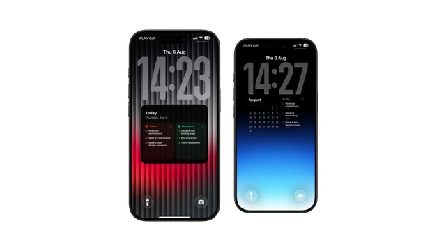
A split view is genuinely useful when the two systems hold different things: Todoist for work, Reminders for the errands and the household items that arrive by Siri. Each keeps its own character and you stop having to check two places.
It collapses the moment the same tasks exist in both, which is more common than people admit. If you catch yourself reading the same item twice on one screen, pick one system for that category and delete the other copy.
7. A big date with the next actions
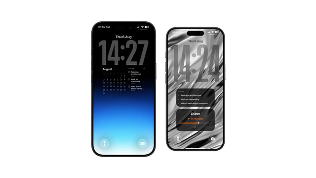
Pairing a countdown with a few tasks works when one date genuinely organises the work: an exam, a launch, a departure. The countdown supplies the distance and the tasks supply the movement, and neither is much use without the other.
Take it down when the date passes. A countdown that has already expired is the fastest way to teach yourself to ignore countdowns.
Todoist stays the source of truth. Reorder, complete and edit there. Calendarly reads with read-only access and draws whichever view you selected.
Minimal is a decision about content
A black background can still be crowded and a colourful screen can still be perfectly clear. What decides it is how many questions the Lock Screen is trying to answer at once, and the answer that works is nearly always one.
Questions people ask
Checklist, focus, project, upcoming agenda, month with tasks, a split view with Apple Reminders, a combined daily timeline and a countdown-plus-tasks composition, each with visual variants.
The focus view for a few large tasks, or the plain checklist for a slightly fuller daily plan.
Yes. Select a project as the source, and switch back to today when the focused period ends.
Yes. Calendarly reads Todoist task priority and project colour for the layouts that use them.
No. They are wallpaper images generated by Calendarly from Todoist data.