Todoist Lock Screen Widget vs Full Todoist Lock Screen
Todoist's widget is live and interactive. A task wallpaper is larger and read-only. When each one is the right tool.
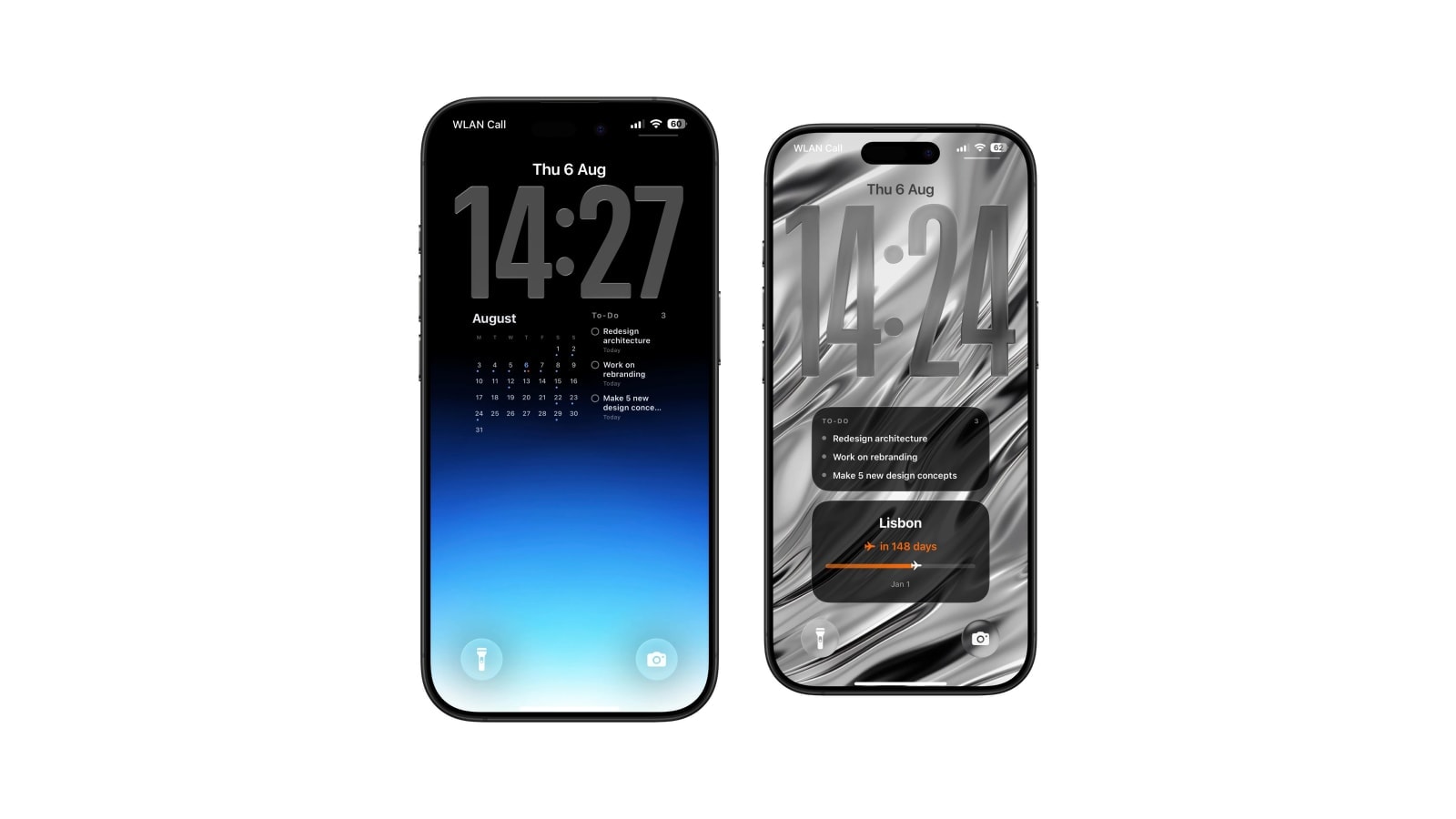
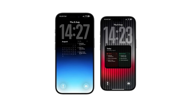
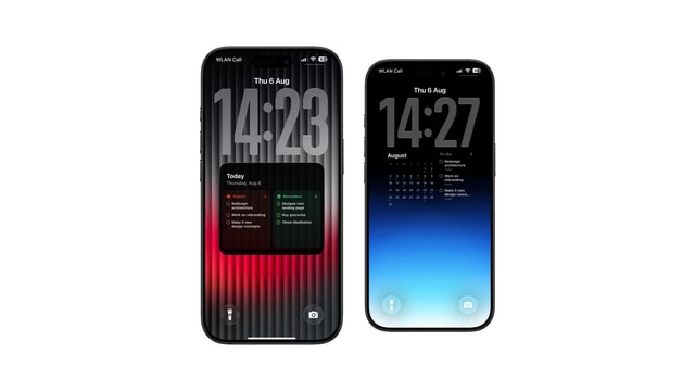
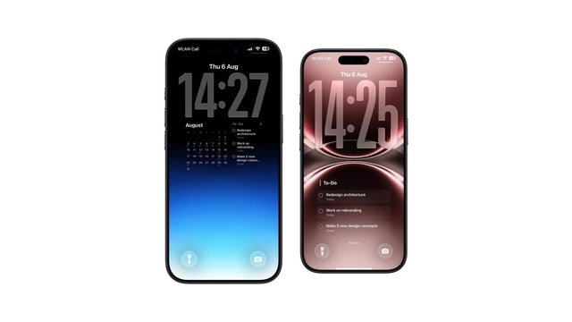
The Todoist widget and a full-screen Todoist wallpaper differ in kind, not in size. One is a live piece of the app running inside Apple’s widget framework; the other is a picture of your tasks, generated on a schedule and applied as the wallpaper.
That distinction explains every practical difference between them, including the ones that surprise people: why the widget cannot be made bigger, why the wallpaper does not update when you tick something off, and why running both is the normal outcome rather than a compromise.
Below is what each one gives you across the five things that actually change day to day.
What the widget gives you
The widget lives inside iOS’s Lock Screen framework, which means Apple decides its dimensions, its position and how many of them fit. Within that box it can show compact task information, a progress figure or a quick action, and because it belongs to the live app it reflects changes almost immediately and takes you into Todoist with one tap.
The fixed size is not a limitation Todoist can engineer around. You can swap one widget format for another, but the row is the row, and no version of it is going to hold a project view. If your complaint is that the widget is too small, the answer is a different surface rather than a different widget.
What a task wallpaper gives you
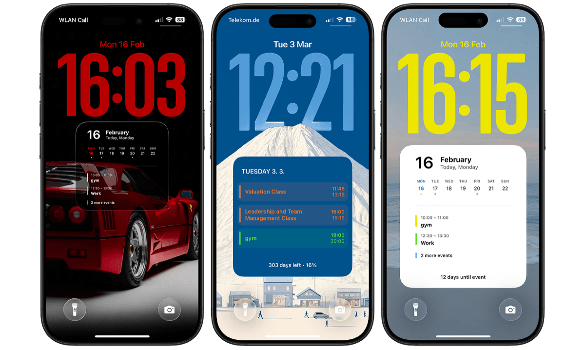
A generated wallpaper uses the whole canvas behind the system interface, which is somewhere around twenty times the area of a widget slot. Calendarly can lay tasks out as a checklist, a large-type focus view, a project card, an upcoming agenda, or a mixed composition with a calendar or a countdown alongside them. The result is usually easier to read simply because it was designed for a full screen rather than for a strip.
The trade is that it is a still image showing the data as it stood at the last render. Nothing is tappable, completing a task does not remove it until the next run, and a task added on your laptop at eleven will not appear until then either. Scheduled updates make it current at chosen moments, which is a very different promise from being current continuously.
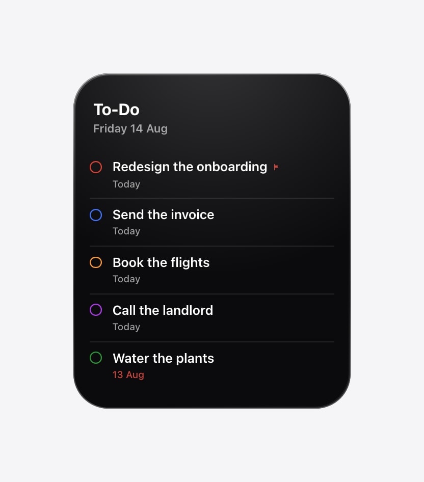
Thirty seconds to add, connected to the app, interactive. Confined to Apple’s widget area forever.
A couple of minutes to set up, room for several tasks, and updated only when it is generated again.
Five questions that settle it
- Do you need to complete tasks from here?
Then the widget, without further debate. A wallpaper cannot receive a tap, and no amount of layout work changes that.
- Do you need several titles visible at once?
Then the wallpaper, or a large Home Screen widget if seeing them after unlocking is acceptable.
- Does the list change through the day?
If other people are assigning and reprioritising continuously, use the live surfaces. A morning snapshot of a fast-moving shared project is confidently wrong.
- Do you want Calendar or Reminders beside it?
A mixed wallpaper can combine sources in one composition. Two separate widgets cannot be laid out relative to each other.
- Do you want the least setup?
Start with the widget. Add the wallpaper only once you can name the thing the widget is not showing you.
Why most people end up running both
Put a next-task or progress widget in the system row and a short plan in the wallpaper underneath. There is no technical conflict, no duplicated permission, and no performance cost; the widget handles the live edge and the wallpaper holds the context.
The only rule worth following is to avoid showing the same item twice. If the widget already shows the next task, let the wallpaper start from the second one, or use it for a different source entirely. Otherwise you have spent both surfaces on a single piece of information.
Task titles are readable while the phone is locked. Both surfaces show them before authentication. Use neutral wording for anything sensitive, and remove detail that does not need to be public.
Questions people ask
The widget is a live, interactive part of Todoist inside a small system area. A task wallpaper is a larger read-only snapshot refreshed on a schedule.
No. Lock Screen widgets are compact by design. Use the app, a Home Screen widget, or a generated wallpaper for more visible tasks.
The native widget. A wallpaper changes only when its generation shortcut runs.
Yes, and most people do. Use the widget for next or progress, and the wallpaper for the broader plan.
No. It asks for read-only access and cannot change anything in your account.