Best Todoist Lock Screen Setup for iPhone
One layout, one source, one automation. The Todoist Lock Screen setup I actually run, and the mistakes to skip.
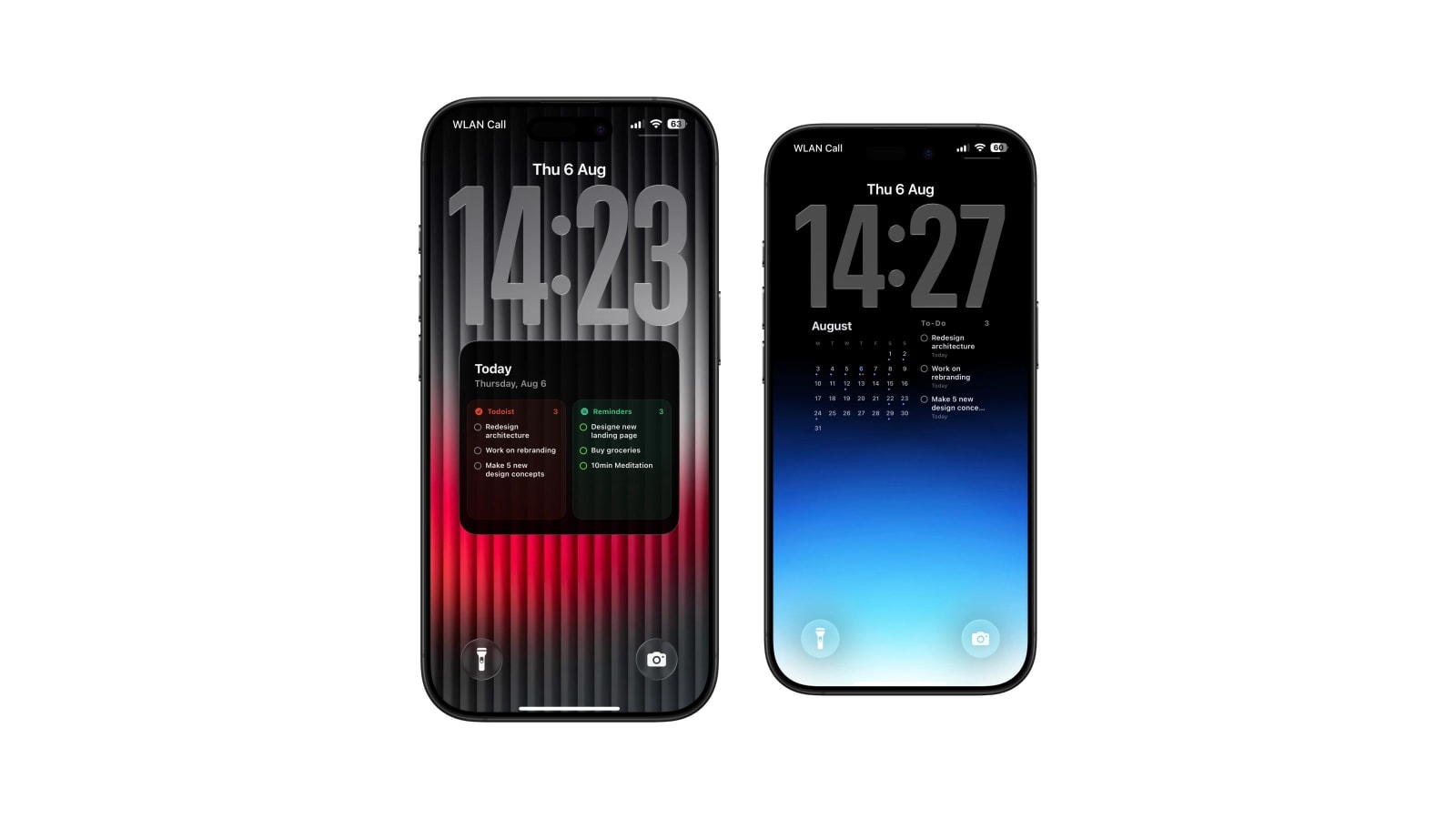
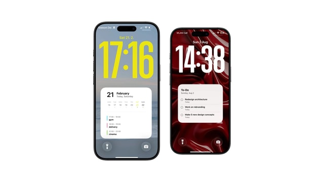
The setup worth starting from is deliberately small: today and overdue as the source, a checklist or focus layout, five or six visible tasks, and one refresh before work. It shows what can actually be started now and leaves everything else in Todoist.
That is a recommendation rather than a compromise. Almost every more elaborate configuration people try converges back on it within a fortnight, usually after discovering that a Lock Screen showing twelve tasks is a Lock Screen nobody reads.
Below is why each of those four choices is what it is, and the specific situations where changing one of them is right.
The layout: checklist first, clever later
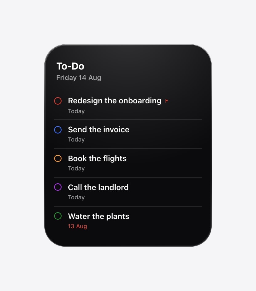
A checklist keeps the order you already maintain in Todoist and leaves room for priority markers, due information and project colour without any of them fighting the task titles. That is the whole argument for it: the titles are the content, and every other layout takes space from them in exchange for something decorative.
A focus view is the one worthwhile alternative, and it is for a different mode rather than a nicer version of the same one. Fewer tasks, much larger type, one clear first thing. It suits deep work and difficult days, and it is genuinely bad at being a daily list.
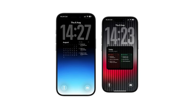
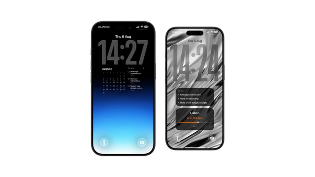
Mixed layouts, with a month grid or a countdown or Apple Reminders alongside, are for particular routines rather than for general use. They are not upgrades. Every additional source is space the task names no longer have.
The source: today and overdue
This source answers the only question a Lock Screen is well placed to answer, which is what deserves attention now. Upcoming and single-project sources both tend to fill the screen with work that is real but not yet actionable, and a task you cannot start is a task that is only there to make you feel behind.
There is a diagnostic hidden in this choice. If overdue items dominate the screen every single morning, the wallpaper is not the problem: your Todoist has a backlog of things that were dated optimistically and never rescheduled. Fix that in the app, where reschedule and postpone exist, rather than shrinking the font so that fewer of them fit.
Best for daily execution, and the least visually noisy because it is naturally short.
Best for a specific stretch: the week before a deadline, the month of a move, the run-up to a launch.
Setting it up
- 1Connect Todoist
In Calendarly, sign in through Todoist. The permission requested is read-only, so nothing in your account can be changed.
- 2Pick checklist or focus
Preview it with your real task titles rather than the sample content. Your titles are longer than the demo ones.
- 3Select today and overdue
Set the visible cap low enough that you can read the list without bringing the phone closer to your face.
- 4Keep the background plain
Priority markers and project colours already supply the accents. A busy photo behind them is three colour systems arguing.
- 5Add one morning automation
Before the working day. Run it by hand after a major re-plan instead of scheduling it every hour.
Details worth being honest about
- It is not live
A completed task leaves at the next render, not when you tick it. If that gap bothers you, keep a Todoist widget for the immediate feedback.
- Read-only is the whole permission
Calendarly cannot complete or alter tasks. The work happens in Todoist and the wallpaper shows it.
- Offline shows the last known list
A per-source cache prevents an empty card on a train, but it is last known rather than current.
- Anyone can read the titles
They are visible before the phone is unlocked. Use wording you are comfortable with a stranger seeing.
You should stop noticing the setup. It ought to be there when you need it and invisible when you do not. If you keep adjusting it, the answer is almost always to remove something.
A good default beats a perfect dashboard
Use the small daily version for a week before changing anything. Most of the refinements that seem obvious on the first evening turn out to be unnecessary by the fourth morning, and the ones that turn out to matter only become visible after a few real days.
The best setup is not the one carrying the most information. It is the one that saves you the check and then stays out of the way.
Questions people ask
Today and overdue. Switch to upcoming or a single project for a specific period rather than as a permanent default.
Five or six at most, and fewer if your task titles are long.
Before you normally start planning or working. One run a day is enough for most people.
Yes. Let it carry the next task or progress and let the wallpaper carry the broader list.
No. The connection is read-only.