Best iPhone Lock Screen Setup for College Students
Timetable on the wallpaper, deadlines as a countdown, reading list as a note. A setup that survives the semester.
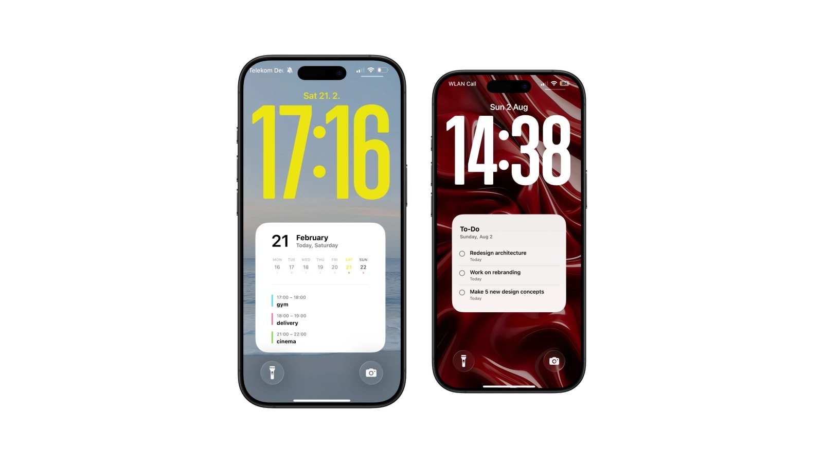
The best student Lock Screen is not a dashboard. It answers three questions, in this order: where do I need to be, what is due next, and how much time is left before it.
Almost every setup that gets abandoned fails by trying to answer a fourth. The screen fills with a habit tracker, a weather widget, a step count and a motivational line, and within a fortnight the whole block reads as texture rather than information. Restraint is not an aesthetic preference here, it is the thing that makes the setup survive past freshers’ week.
What follows is a setup built in three layers, with a note at the end on what deliberately does not go on it.
Layer one: the week
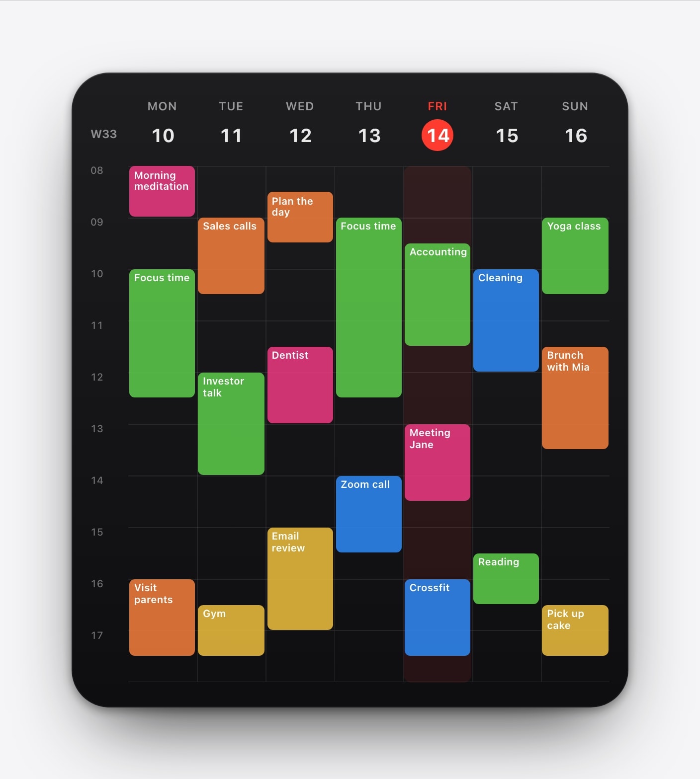
The timetable is the foundation because it is the thing you check most and the thing that is most annoying to look up. Put classes in a dedicated Apple Calendar with weekly repetition and an end date at the last teaching day, keep the room codes short, and add office hours and labs only if you genuinely attend them.
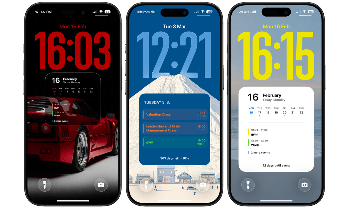
Then use a week grid rather than a daily view. The grid is worth it for students specifically because the gaps carry information: the hour that is actually free for the library, the morning you can sleep, the two-hour hole on Thursday that is the only time you will realistically start the essay. A daily agenda hides all of that until the day arrives, by which point it is too late to plan around.
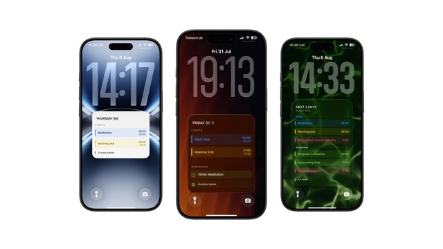
If your course names are long enough to be cut off, switch to a next-days list instead of shrinking the type. Unreadable is worse than incomplete.
Layer two: exactly one deadline
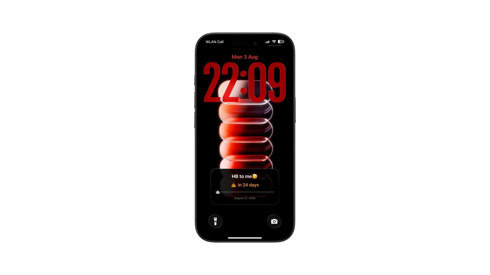
A countdown works because it converts a vague future into a number you cannot argue with. Twelve of them do the opposite: a wall of shrinking numbers flattens into background pressure and none of them changes what you do today.
So choose one. Usually it is the next thing with real consequences and the least slack, which is not always the nearest date. A dissertation eight weeks out often deserves the screen more than a quiz on Friday, because the quiz will get done anyway and the dissertation will not.
If you add a next action beside it, keep it concrete and small enough to finish. “Draft methods section” is a countdown’s useful companion; “work on dissertation” is a way of feeling busy. Replace it the moment it is done, because an expired instruction on a screen you see fifty times a day is training you to ignore the screen.
Layer three: nothing
This is the layer people skip and it is the one doing the work. Everything you leave off makes the two things you kept easier to see, and a Lock Screen is read in a fraction of a second while walking between buildings, in bright sun, with one hand full.
The reading list, the habit tracker, the water intake, the quote: all of those have homes that are one swipe away and none of them changes a decision you make in the corridor. If a piece of information does not alter where you go or what you start next, it is costing you legibility for nothing.
The widget row is for live things
Apple’s widget row and the wallpaper are good at opposite jobs, and using each for what it is good at solves most of the crowding problem on its own. Widgets are small, live and tappable, so they suit the next event, a timer, the battery, or the weather when you are deciding whether to cycle. Apple’s widget guide covers adding them.
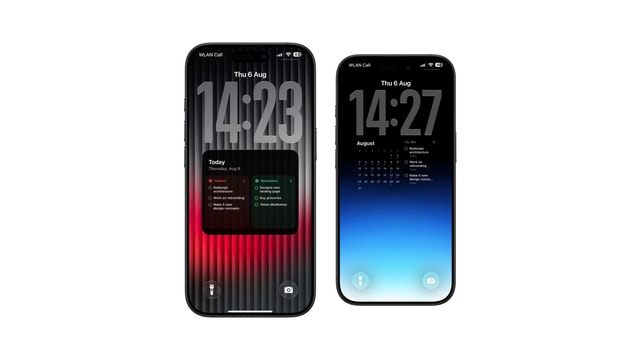
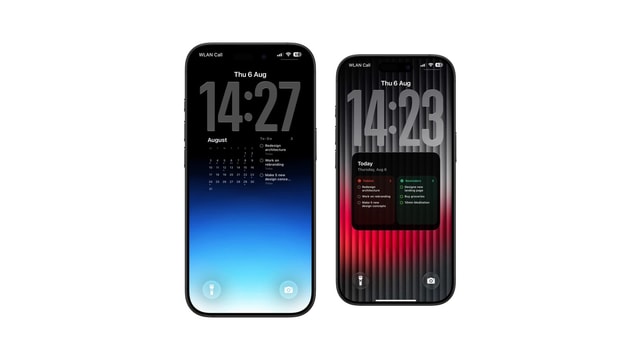
The wallpaper is large, still and generated, so it suits the week and the deadline. Splitting them this way also stops the two surfaces from duplicating: if the widget already shows your next class, the wallpaper does not need to shout about it, and can spend its space on the other four days instead.
The next event, a timer, a battery level. Small, tappable, updated continuously by iOS.
The week and the deadline. Far more room, generated once each morning, nothing to tap.
A term’s worth of maintenance
Set up properly, this needs attention about three times a semester, which is the only reason it survives. Everything below takes a few minutes at the start and then nothing until something real changes.
- 1Week one: build the term calendar
Repeating classes with an end date, one colour, subscribed feed if the university publishes one.
- 2Week one: pick the layout and test it
Preview with your real course names, not the sample content. Shorten titles before you shrink type.
- 3Week one: add one countdown and one automation
A morning run before your earliest class. Run it by hand once and lock the phone to confirm.
- 4After each deadline: swap the countdown
Thirty seconds. Leaving an expired date up is what kills the habit.
- 5After an iOS update: run the shortcut manually
Major updates can reset permissions or lose the target Lock Screen.
Move the information before deleting the apps. If the only reason you open the phone is to check the next class, putting that answer on the Lock Screen removes the unlock, and with it the accidental trip through messages and feeds.
Questions people ask
A weekly timetable as the wallpaper, one deadline countdown, and widgets only for small live information such as the next event or a timer.
Yes. Keep it in Apple Calendar and let a Calendarly shortcut regenerate the wallpaper each morning, including changes from a subscribed university feed.
It removes some unnecessary unlocks by answering the question before you open the phone. It is not a screen-time solution on its own.
No. A long visible list is hard to scan and creates constant low-level pressure. Show one next action and keep the backlog in a task app.
No. Calendar wallpapers and Shortcuts automations work on iOS 16.6 and later.