Calendar and Reminders on One iPhone Lock Screen
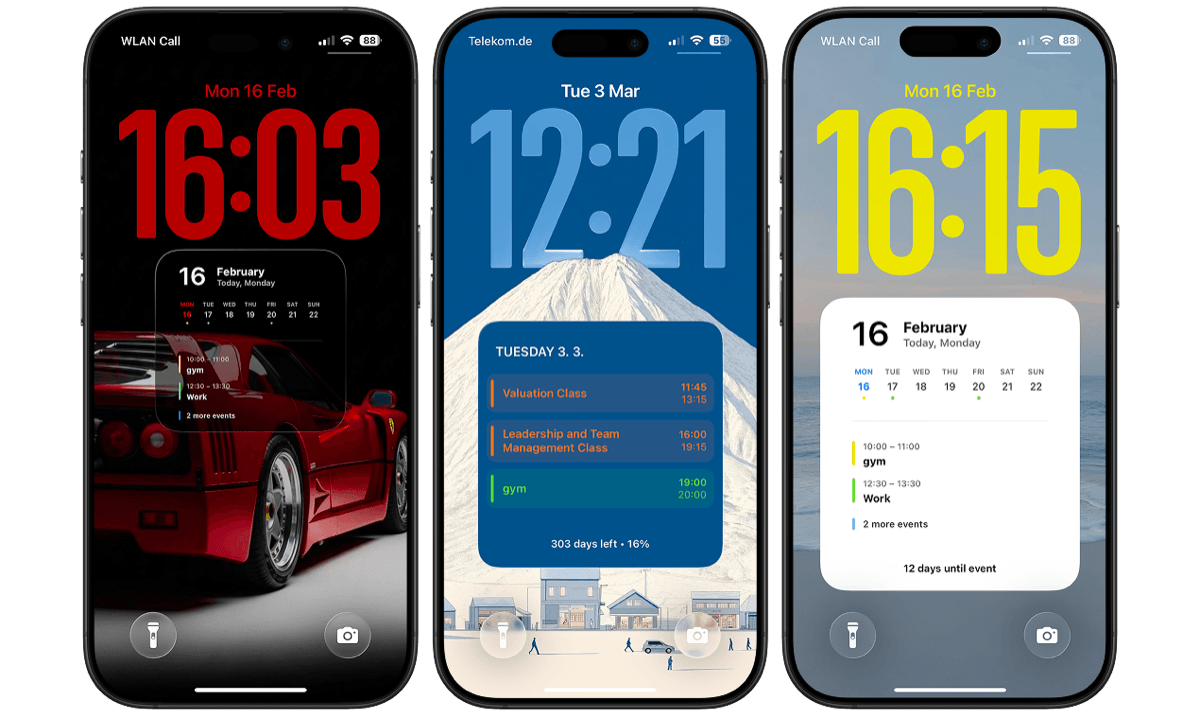
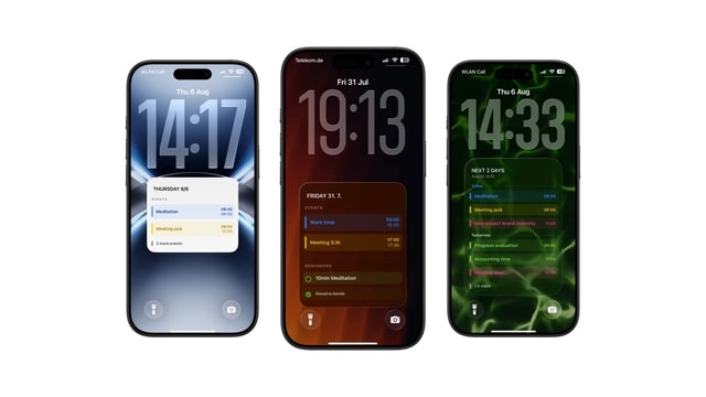
Keep a live widget for quick actions, or use a larger read-only wallpaper when you want events and reminders in one calm view.
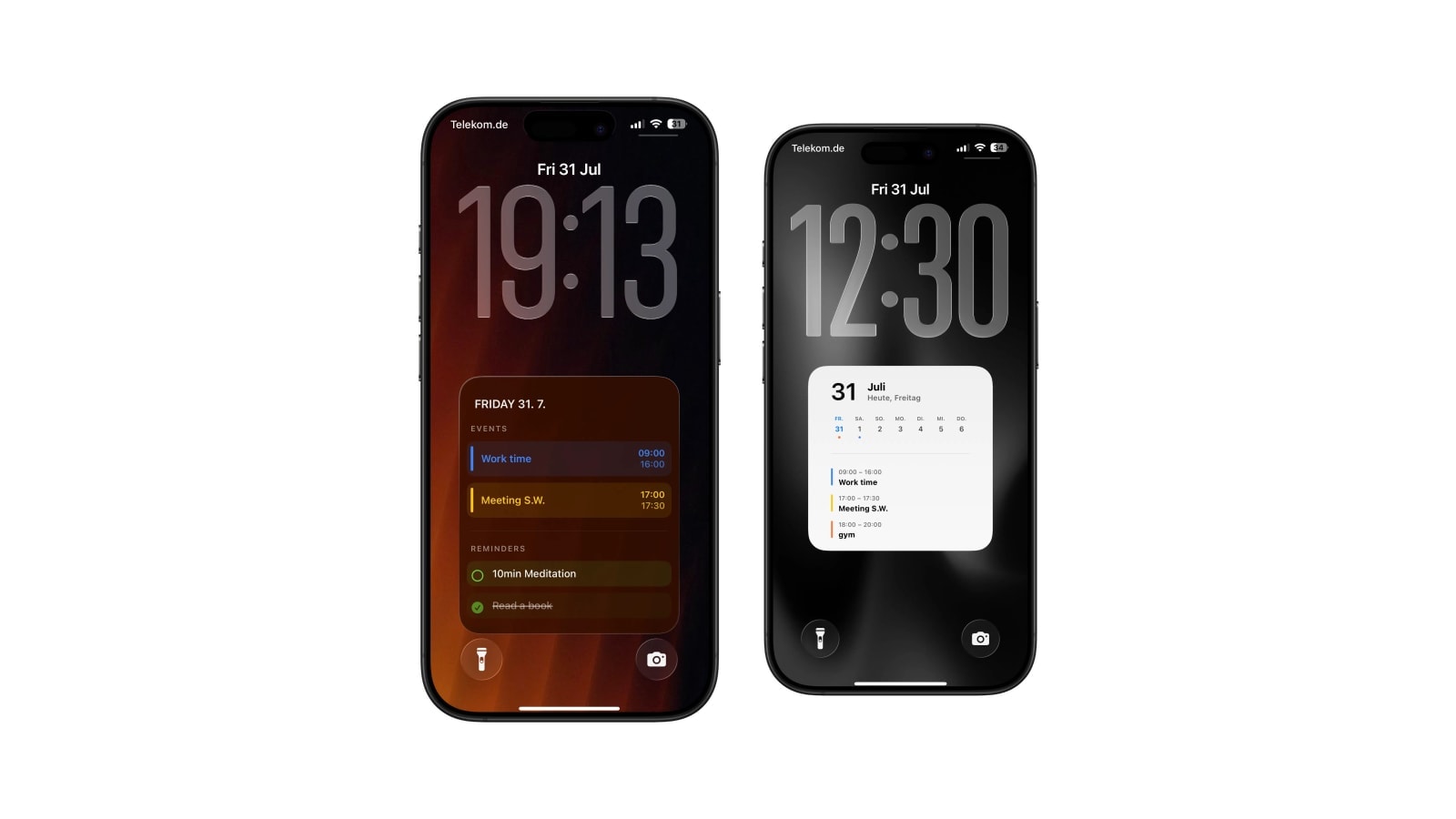
You can have both on one Lock Screen. The widget row will take one widget from each app, and a generated wallpaper can put the day’s events and a short reminder list together on the much larger canvas behind the clock.
The reason anyone wants this is that events and tasks are usually two halves of the same day. The ten o’clock meeting and the document you have to send before it are one situation, not two, and keeping them in separate apps means holding the connection in your head. Seeing them side by side is a small thing that removes a surprising amount of friction.
What follows is why Apple splits them in the first place, how to combine them without producing a cluttered screen, and what happens when you tick something off.
Why Apple keeps them in different apps
An event occupies time. It has a start, an end and usually a place, and once it exists you cannot do very much about it except attend. A task has none of that: it has a decision attached to it and, at most, a date by which the decision has to be made. They look similar written down and they behave completely differently, which is why merging them into one list has been tried repeatedly and keeps producing something worse than either.
The Lock Screen inherits that split. You can add a Calendar widget and a Reminders widget, and each gets its own small system-defined slot, which is genuinely useful for one next event and one actionable task. It stops being useful the moment you want the context around either of them, because there is nowhere for that context to go.
Best when tapping matters more than seeing. You can open Calendar or tick a reminder without unlocking, and that is worth a lot.
Best when you want several events and several tasks at once, and can accept that it refreshes on a schedule instead of instantly.
Build it with fewer sources than you think you need
The instinct is to include every calendar and every list, since they are all yours and they all seem important. In practice one or two calendars and a single reminder list produce a far better Lock Screen than the full set, because the screen is read in a second and every extra row costs the others space.
In Calendarly, choose a combined layout, select the sources, then look at it with your real events and tasks rather than the sample content. That preview is where the decision actually gets made: if the event titles are long, the schedule needs the larger half, and if your tasks carry dates or notes that matter, the reminders do. Nothing is being merged or rewritten, so the original items stay exactly as they are in Apple Calendar and Reminders.
- 1Pick the calendars that change where you have to be
Work and personal usually. Subscribed holiday and sports feeds almost never earn their space here.
- 2Pick one reminder list
Today, Work or Errands. An unfiltered inbox mixes next week’s admin with this morning’s decision.
- 3Cap the visible items
Four or five reminders is plenty. The Lock Screen is a plan, not a backlog viewer.
- 4Add the morning refresh
One run before your day starts. The guided automation takes about two minutes to add.
What happens when you finish something
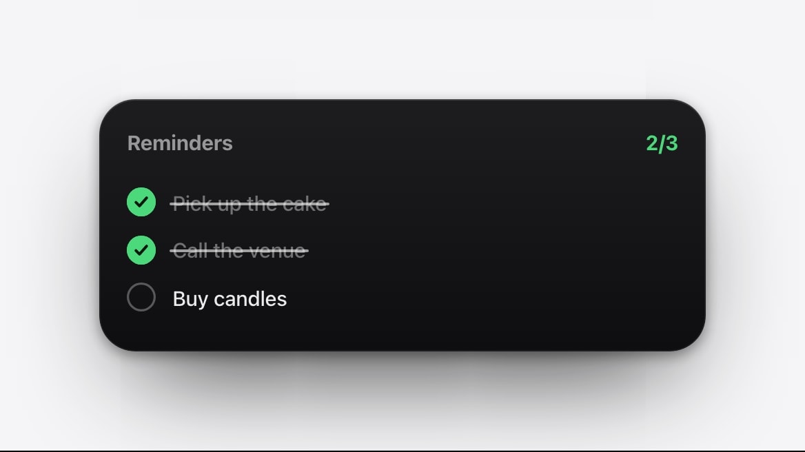
Ticking a reminder in the Reminders app changes the source immediately, and the wallpaper carries on showing it, because the wallpaper is a picture taken earlier. It disappears at the next render, either on schedule or when you run the shortcut by hand.
For most people that lag is fine and occasionally even pleasant, since a completed item staying visible until the evening is a small record of the day. If it bothers you, the fix is to keep a Reminders widget as well: interactive widgets let you tick an item off from the Lock Screen and reflect it straight away. The widget handles the tap, the wallpaper handles the overview, and neither is trying to be the other.
The wallpaper does not know what you did. It shows the state at the moment it was generated. Run the shortcut manually when you want the screen to catch up now.
Keeping both halves readable
- Write reminders as verbs
“Send slides” is a decision you can act on in ten seconds. “Slides for Friday meeting” is a label, and your eye has to translate it every time.
- Do not duplicate the schedule as tasks
If something is already an event with a time, it does not need a reminder as well. Duplicates are the fastest way to fill a combined layout with nothing.
- Let finished work leave
Complete or archive things instead of carrying them as history. A list that only grows stops being read.
- Match the refresh to your rhythm
One morning run suits a stable day. Add an afternoon run only if both the meetings and the tasks genuinely churn.
One screen, two jobs, kept separate
The combined view works precisely because it does not blend the two things. Time stays time and tasks stay tasks; the only thing that changes is that you stop opening two apps to see how they meet.
Start with the simplest combined layout on Calendarly and, if it feels busy, remove a source rather than shrinking everything to fit.
Questions people ask
Yes. Use one widget from each app, or generate a wallpaper that combines selected events and reminder lists in a single image.
No, a wallpaper is an image. Use the Reminders app or an interactive Reminders widget to complete items, then refresh the wallpaper.
At the next render. The current image does not change on its own when you complete something.
Any Apple Calendar sources and Reminders lists on the iPhone that you have granted access to and selected.
No. Calendarly reads the selected sources and draws a view of them. The original events and reminders stay exactly as they are.